Color matters! If you’re planning on redecorating and painting your walls, read this quick guide to help you put colors together properly.
Color can optically enlarge or reduce a room. This principle also applies to individual walls. Light colors widen, dark colors narrow. If you have a narrow and long corridor, light colors on the side walls will make it appear wider, and a darker wall at the end will gently shorten it. Painting one wall a shade lighter than the others also gives an interesting effect.
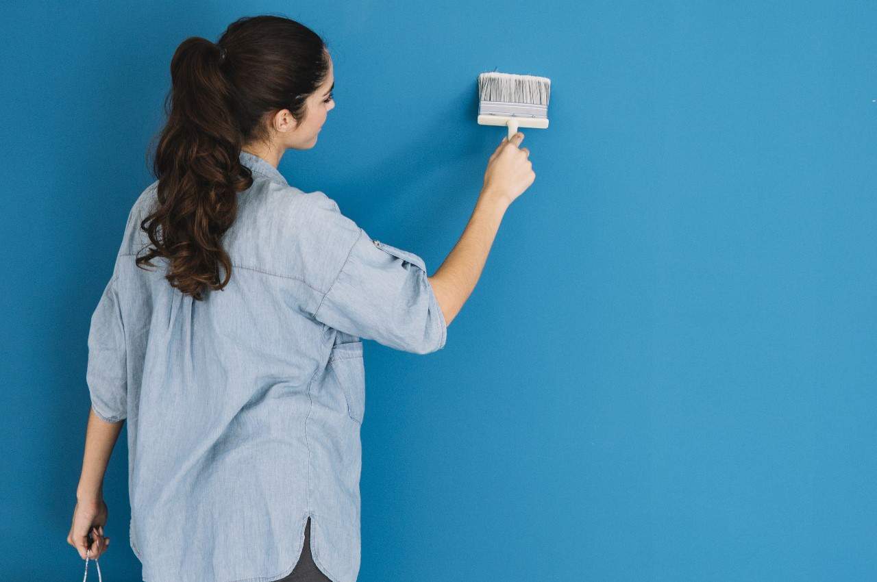
Bright colors are best used in small rooms, then they seem larger.
This is a common interior design dilemma. How to paint an interior to make it a coherent whole?
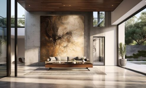
If you like calm elegance, it is worth considering consistency of one color in many shades. Most often white, light gray, graphite up to black works well. Generally white walls prevail, but it is very interesting to distinguish one wall in another color, such as gray or even dark, anthracite. Such a wall may isolate another zone of the room, for example a corner for watching TV or listening to music.
Another common range of colors are beiges, browns, soft, subdued yellows, oranges and warm browns. Such an interior is, depending on the saturation of colors, either calm and calming, or on the contrary – bursting with energy. Painting the walls in light cream or beige and isolating one wall in another color from this range, e.g. mild brown, will give the room a character of old-fashioned elegance. Orange will release energy, sunny yellow – optimism.
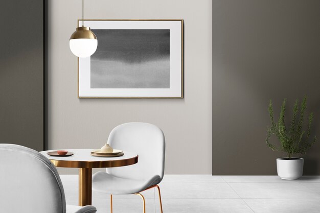
A combination of white and gray, popularized by the trendy Scandinavian style, looks interesting. While very feminine and elegant is the combination of white and beige or sandstone.
The combination of cream and beige with olive green looks extremely elegant. If the room has an alcove with a beautiful, stylish bookcase, you can paint it in olive color or place a stylish, comfortable armchair in such a place.
Contrasts are less safe. Suggesting a color combination on your favorite blouse can be a source of disappointment. Strong colors on the walls do not always look good, but it is great to put one or two strong colors on a light background. A combination of gray with another strong color looks very good. Gray goes well with blue, green, purple and pink. One or two walls in this color will enliven the room. You can play with shades by using darker or lighter shades of the same color. Adding one more color can also be used, but be careful not to have more than four in one room.
The most popular contrasts are the combination of white and black and pop art colors – strong red, sharp yellow, navy blue and green with black fine lines cutting the colors apart.
Delicate, pastel or powder colors look good in children’s rooms. Here you can boldly combine bleached pink with blue. Such combinations should be carefully used in bedrooms and living rooms to avoid association with kitsch.
Another idea is to play with colors and textures. You can get an amazing effect by combining the same color and shade, but in a set of matte and gloss. Matte absorbs light, while shiny reflects it. The combination can give an interesting three-dimensional effect.
Wide stripes may lengthen or widen the room. Such effect is given by stripes of two colors, placed parallel to each other. However, it is more convenient to lay a wallpaper with such an idea. In turn, the paints can optically “cut off” the bottom of the walls, painting them in a different, even contrasting color. Most often the top is light, and the bottom dark. This looks great in a bedroom, where the border between colors is additionally marked with a stucco strip. The lower part of the wall can be in deep purple, navy blue or bottle green, the top is gray or cream.
Large areas are not easy to plan colors. It is worth using graphic programs, which, although they do not fully reflect the final effect, but allow your imagination to suggest how the space changes depending on the color, its intensity and placement.